
Great covers are forged, not born.

And it’s a collaborative process. I love the cover for A Wizard’s Forge (to be released September 19, 2016). Long ago, when I first imagined what the cover of this book would look like, I wanted the focal point to be Vic’s hair. I envisioned it flowing down her shoulders and twisting into the point of the totemic dagger that symbolizes her quest for vengeance. The novel, after all, chronicles Vic’s unlikely transformation from a bookish teenage girl to the most powerful and dangerous person on her planet. It also has some thematic roots in the Grimms’ “Rapunzel,” so the hair also has its own totemic symbolism.
The final cover is better than that, because it captures Vic’s grit, determination, and general bad-assery, as well as suggests her transformation isn’t easy. It’s hot and hard; it’s painful, and it’s going to leave scars.
In a technical brief on the design process published on Fstoppers, artist Steven Meyer-Rassow writes:
In the book, Vic is forged into life through both external and internal events, and the author and publisher were keen to use this idea of forging and bringing to life as the visual vehicle for the cover composition. We all agreed Vic should be poured into life somewhat similarly to molten metal or lava pouring out of a furnace and creating a fiery weapon.
 Yep, that’s all true. We had several brainstorming discussions to arrive at this idea, however. First I told everyone my idea with the hair twisting into a dagger. We also talked about the world of Knownearth and my preferences for fantasy and scifi artwork. Initially, if the hair-to-dagger idea couldn’t be executed well, I wanted to go for a more abstract cover design with a single symbolic object on the front, similar to some of the Song of Ice and Fire covers. Some of the first spit-ballery images we used for brainstorming appear on one of Steve’s Pinterest pages, and we all became fixated on the poster art for the first season of ABC’s Revenge.
Because AWF is thematically structured according to the forging process (it’s divided into four parts: Ore, Smelt, Forge, and Temper), we arrived at the molten metal idea. After the first brainstorming session, Steve roughed out some sketches that involved Vic either sitting in a forge fire or being cast from molten metal. However, Patrick–my project manager at Wise Ink Creative Publishing–worried that this approach would make people think the book was about a male wizard creating women, like some sort of golem or Frankenstein’s Bride. The book is really about how Vic recasts herself–it’s her self-actualization. Then Patrick and his colleagues proposed the artwork capture the pouring into being concept as portrayed in the title sequence of Netflix’s Daredevil.
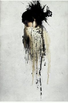
That idea inspired Steve to propose this piece of art as the inspiration for AWF‘s cover. After that, we were off to the races. As Steve describes, he sent out an online casting call, and we chose Michelle Duckett. I couldn’t have asked for a better model–Michelle perfectly captured Vic’s complexity, toughness, and vulnerability in that hunched, over-the-shoulder frown.
The final cover wouldn’t have come into being without this team effort. It’s so good I want hurry up and to finish AWF‘s sequel, just so I can work with this awesome team of people again, and see how the cover for A Wizard’s Sacrifice turns out.
The eBook of A Wizard’s Forge is available for pre-order on Amazon now, or if you’d like to purchase a signed copy of the physical book, please contact me through my website.

2 thoughts on “Cover Story”